MCB StudiosMCB StudiosMCB StudiosMCB Studios
  • About
  • Services
  • UX Toolkit
  • Contact
  • About
  • Services
  • UX Toolkit
  • Contact
New West Knife Works

Showcasing craftsmanship through a simplified shopping experience.

  • September 18, 2025/
  • Posted By : maia/
  • 0 comments /
  • Under : Case Studies

New West Knife Works Case Study

New West Knife Works is a Wyoming based high end kitchen knife company, but their website needed a revamp to better reflect the artistry and high end feel of their products and physical stores. I redesigned NWKW’s website to reflect the artistry and premium quality of their high-end knives. By simplifying navigation, streamlining shopping pages, and integrating storytelling into product detail pages, the new design creates a luxurious and intuitive online shopping experience.

Deliverables: Wireframes, Usability Audit, Product Strategy

Overview:

New West Knife Works (NWKW) have beautiful physical stores that conveyed the artistry and premium quality of their products, but the website fell short. The brand story lacked cohesion, the shopping experience was confusing, and the overall look and feel didn’t reflect the craftsmanship behind the knives.

The Challenge:

The site was trying to do too much. Its navigation mixed press, knife guides, chef reviews, and blog posts with shopping pages, making it hard for customers to focus on the primary goal: purchasing knives. Category pages felt cluttered, product pages were confusing, and poor photography further diminished the luxury feel of the brand.
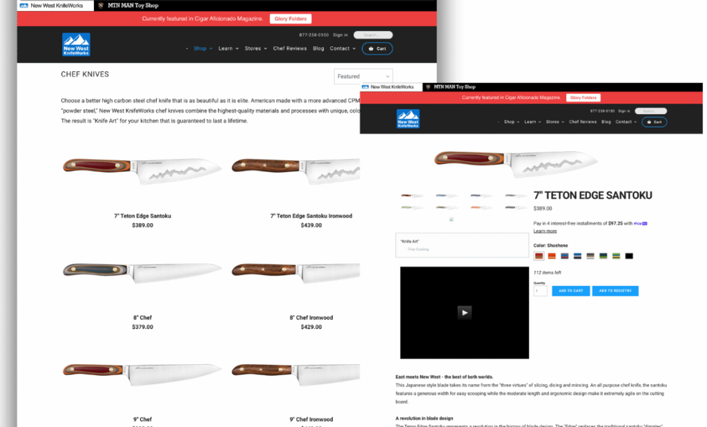
Category pages were long and difficult to follow.
Product detail pages scrolled endlessly and were confusing in many ways, including the knife imagery being very separated from the knife options and details like custom engraving were completely lost. The products on the site did not seem luxurious.

The Process:

We began with stakeholder interviews, a competitive landscape analysis, and a review of user behavior in Google Analytics and Crazy Egg. From these insights, I developed a product strategy to simplify and elevate the online experience.
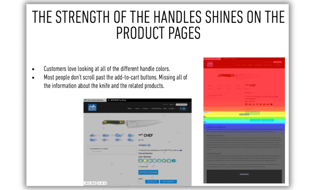
We reviewed user behavior in google analytics and crazy egg to determine what people were actually doing on the site. We discovered that although they were convoluted, people were clicking around on the top of the PDP’s, but they were missing all of the education content below.

Key recommendations included:

  • Lead with commerce, support with content. Use storytelling strategically, integrating shopping modules like promo slots and “shop this article” galleries into content.
  • Streamline templates. Launch with one highly designed template and one flexible template to test and refine content types.
  • Elevate photography. Showcase products with high-quality images that highlight artistry and craftsmanship.
  • Design for multiple entry points. Recognize that visitors often land on side pages, so every page should function as a homepage-level introduction.
  • Clarify navigation. Use it to communicate NWKW’s offerings and tell the brand story globally.
  • Leverage the homepage. Highlight bestsellers and the unique stories behind the products, people, and technology.

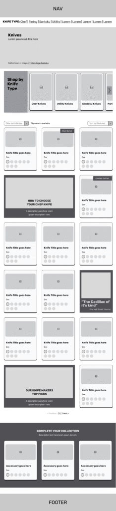
To address these issues, I designed wireframes exploring multiple solutions, focusing first on the most critical shopping pages – the product detail pages (PDP) and product category pages (PCP). As these were the main shopping pages, they were most important to get right first. 

These designs explored how to:

  • Showcase NWKW’s most premium “Rock Block” sets.
  • Integrate content like quotes, videos, and quizzes alongside necessary product details.
  • Encourage upselling by suggesting complementary products (“complete your set”).

On the redesigned product detail page, our goal was to make each knife feel as exceptional online as it does in person. We brought the key benefits front and center, then layered in storytelling—like guidance on what the knife is best for, along with rich photos and videos—so shoppers could both appreciate the craftsmanship and feel confident in their purchase.

Customers told us again and again how much they loved NWKW’s colorful knife handles. In the redesigned category page, we brought those options front and center—so shoppers could explore the variety without diving into each product page. To make the experience even richer, we layered in educational content that helps customers appreciate what makes each knife unique.

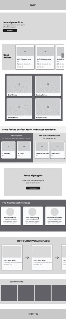
For the redesigned homepage, our focus was on celebrating the full breadth of NWKW’s offerings. Instead of a fleeting carousel, we created a persistent hero area that could spotlight featured products and promotions. Just below, we showcased best sellers and emphasized that no matter what type of chef you are, there’s a knife for you. To bring the brand’s craftsmanship to life, we added a playful section highlighting how the knives are made—a process as distinctive as the products themselves.

The Solution:

The redesigned product detail pages elevated the artistry of NWKW’s knives while simplifying the path to purchase. By blending expected shopping functionality with immersive storytelling, the new design created a differentiated experience — one that reflects the premium brand identity without simply copying competitors in the high-end kitchenware space.
Tiff's Treats

Streamlining how customers order warm cookies

  • September 17, 2025/
  • Posted By : maia/
  • 0 comments /
  • Under : Case Studies

Tiff’s Treats Case Study

Tiff’s Treats delivers cookies fresh from the oven or shipped nationwide, but their online ordering process didn’t match the joy of receiving them. I redesigned the bundling and checkout flows to be simpler, clearer, and more intuitive—helping customers build the perfect order without the frustration of a cluttered menu.

Deliverables: Wireframes, Usability Audit, Product Strategy

Overview:

Tiff’s Treats’ online ordering system had become overly complex, leading to customer frustration and high cart abandonment rates. Streamlining this experience was essential to improving usability and ensuring that ordering cookies online felt as joyful and simple as receiving them.

The Challenge:

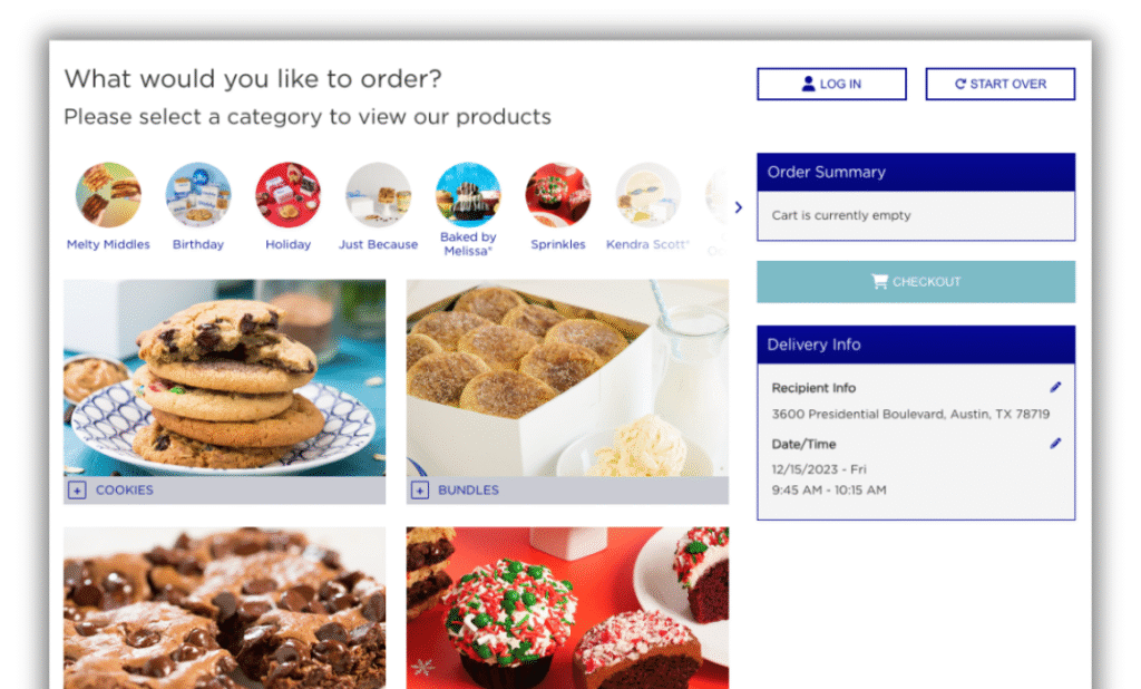
Over time, the menu expanded without a cohesive structure or clear categorization. The result was a lengthy, cluttered product list that forced users to scroll through dozens of items. This made it difficult for customers to quickly find what they needed—particularly those shopping for a specific occasion or trying to build a bundle.

Order page was littered with extra information
Product categories/occasions were busy and blended in with the menu below
Product offering area was constricted due to cart and delivery info being on the page.

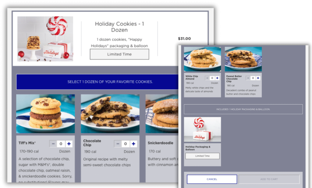
The bundle purchase process was significantly challenging
The process of adding a bundle to your cart was inconsistent with purchasing any other product. 
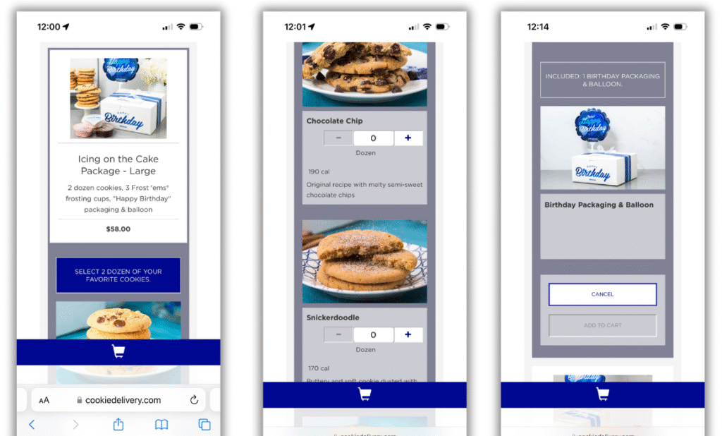
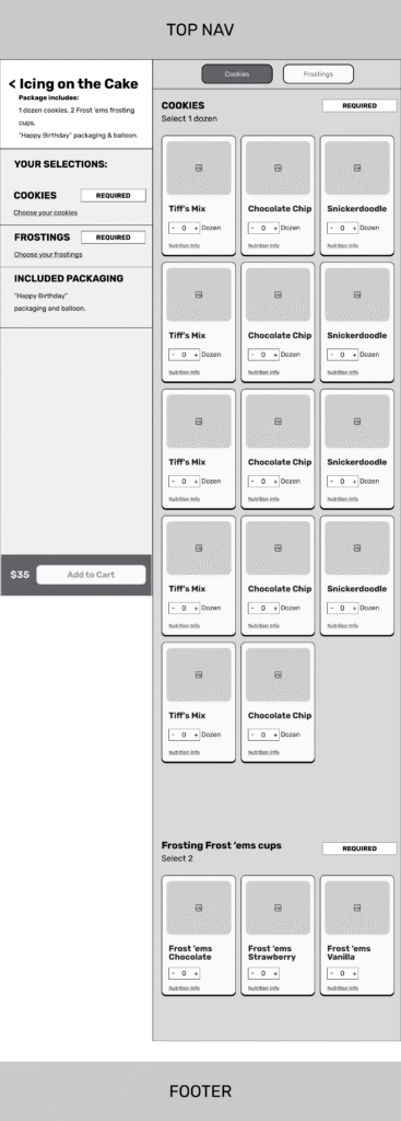
Selecting cookies for your bundle was confusing. Instructional text was small and Add to Cart button was far removed. 

…and it was even tougher on mobile
It was difficult to figure out what you were ordering on mobile due to the long scroll between choosing a product and hitting Add to Cart.
The unlabeled, consistent cart button at the bottom was confusing. It was unclear whether the button was to see your cart, or add to it.

The Process:

We began with stakeholder interviews and a comprehensive usability audit of the site, guided by Nielsen’s 10 Usability Heuristics. From this, we developed a clear product strategy to simplify the experience.

Key findings included:

  • Instructional and error messaging lacked clarity.
  • Ordering and checkout flows were unnecessarily cumbersome.
  • Content was poorly organized, overwhelming users with too much information at once.
  • The overall experience detracted from the delight of gifting cookies.

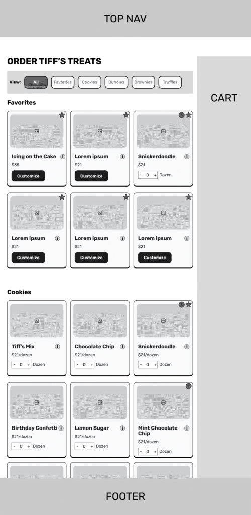
To address these issues, I designed wireframes exploring multiple solutions, focusing first on the ordering and bundling flows. I presented two distinct approaches that made bundling options more transparent and gave users a clear sense of how many steps were involved in the process.

The presented wireframes had a locking header for users to navigate to the different categories of cookies. Users were able to easily see which types of cookie boxes could be customized and which were favorites. Users could also add cookies to their cart directly from this page. The persistent cart was a customer technical requirement which we could not get around.

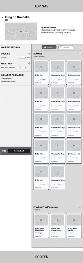
For bundle customization, users were able to easily see how many items they needed to select. On the left side of the screen was a running tally of what customizations they had made, as well as items in the bundle that would come by default.

Once users had customized all necessary items the add to cart button would become active and the bundle could be purchased.

The Solution:

The redesigned bundling page significantly reduced confusion. Options were presented in a clear, structured way, and users reported a much better understanding of how to build their bundles. Early testing showed positive feedback, with customers finding the experience more intuitive and enjoyable.


I’m Maia, an award-winning UX designer and product strategist with 20+ years helping startups, Fortune 500s, and mission-driven organizations craft products people actually love. I thrive where design meets business, turning research insights into intuitive, usable experiences — and yes, I secretly love making order out of chaos.

Latest Posts
  • Showcasing craftsmanship through a simplified shopping experience.
  • Streamlining how customers order warm cookies
  • When should you hire a UX designer
Copyright 2025, All Rights Reserved MCB Studios LLC