
Streamlining how customers order warm cookies
Tiff’s Treats Case Study
Tiff’s Treats delivers cookies fresh from the oven or shipped nationwide, but their online ordering process didn’t match the joy of receiving them. I redesigned the bundling and checkout flows to be simpler, clearer, and more intuitive—helping customers build the perfect order without the frustration of a cluttered menu.
Deliverables: Wireframes, Usability Audit, Product Strategy
Overview:
Tiff’s Treats’ online ordering system had become overly complex, leading to customer frustration and high cart abandonment rates. Streamlining this experience was essential to improving usability and ensuring that ordering cookies online felt as joyful and simple as receiving them.
The Challenge:
Over time, the menu expanded without a cohesive structure or clear categorization. The result was a lengthy, cluttered product list that forced users to scroll through dozens of items. This made it difficult for customers to quickly find what they needed—particularly those shopping for a specific occasion or trying to build a bundle.
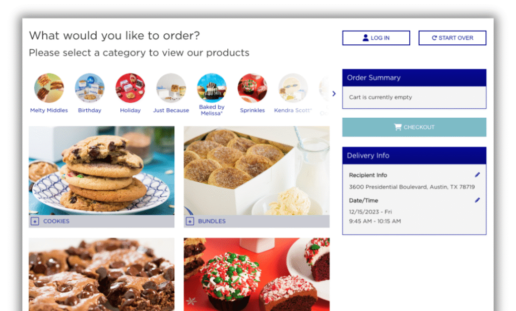
Product categories/occasions were busy and blended in with the menu below
Product offering area was constricted due to cart and delivery info being on the page.
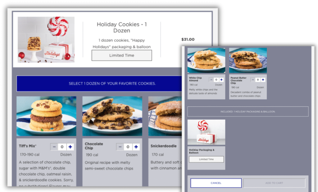
The process of adding a bundle to your cart was inconsistent with purchasing any other product.
Selecting cookies for your bundle was confusing. Instructional text was small and Add to Cart button was far removed.
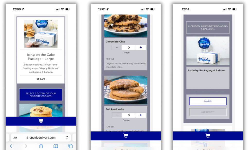
It was difficult to figure out what you were ordering on mobile due to the long scroll between choosing a product and hitting Add to Cart.
The unlabeled, consistent cart button at the bottom was confusing. It was unclear whether the button was to see your cart, or add to it.
The Process:
We began with stakeholder interviews and a comprehensive usability audit of the site, guided by Nielsen’s 10 Usability Heuristics. From this, we developed a clear product strategy to simplify the experience.
Key findings included:
- Instructional and error messaging lacked clarity.
- Ordering and checkout flows were unnecessarily cumbersome.
- Content was poorly organized, overwhelming users with too much information at once.
- The overall experience detracted from the delight of gifting cookies.
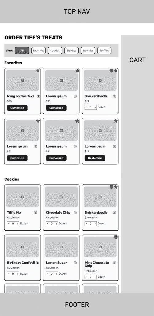
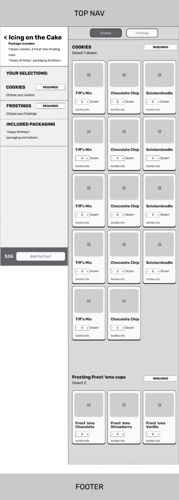
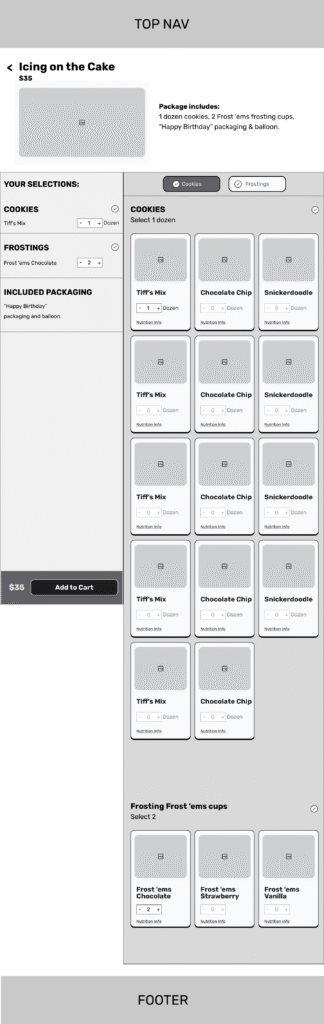
To address these issues, I designed wireframes exploring multiple solutions, focusing first on the ordering and bundling flows. I presented two distinct approaches that made bundling options more transparent and gave users a clear sense of how many steps were involved in the process.
The Solution:
The redesigned bundling page significantly reduced confusion. Options were presented in a clear, structured way, and users reported a much better understanding of how to build their bundles. Early testing showed positive feedback, with customers finding the experience more intuitive and enjoyable.